Jessica Hische exhibition in Melbourne

I’ve been admiring the work of NY based typographer, designer and illustrator Jessica Hische from afar for a while now, but last weekend whilst on a short visit to Melbourne I was excited to able to catch an exhibition of her excellent typography work in person. The exhibition was pretty small (let’s say bedroom–sized). But I really enjoyed geeking-out at her detailed lettering up close. There’s a definite retro-ness to her work (perhaps that should be “respect for typographic history”?) and it's super-playful.

I picked up a limited edition print which will be sure to get the framing treatment and go straight to the pool room.

More internettings of Jessica here.

Prime Wallpaper

I get lots of requests for this, so finally: desktop wallpaper! Optimus Prime from my cover to IDW Publishing’s All Hail Megatron, #9.

Download it now! This link will download a ZIP file containing wallpapers for the 7 most popular screen resolutions: 1920 x 1200 | 1920 x 1080 | 1680 x 1050 | 1440 x 900 | 1280 x 1024 | 1280 x 800 | 1024 x 768

Think of it as compensation if you missed out on a signed cover book!

Casarramona

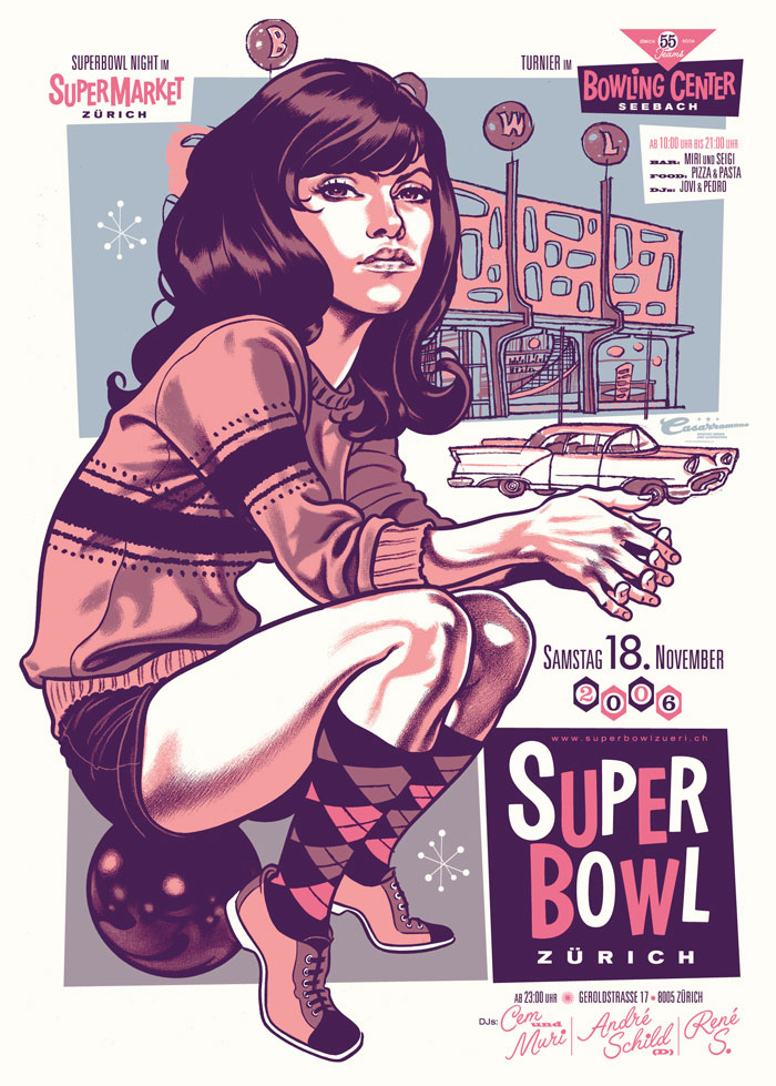
One of my favourite contemporary illustrators is Zürich-based designer Michel Casarramona. He makes fantastic use of caricature, custom typography and colour, and wraps it in retro-inspired goodness. Like.

Vintage concert poster design

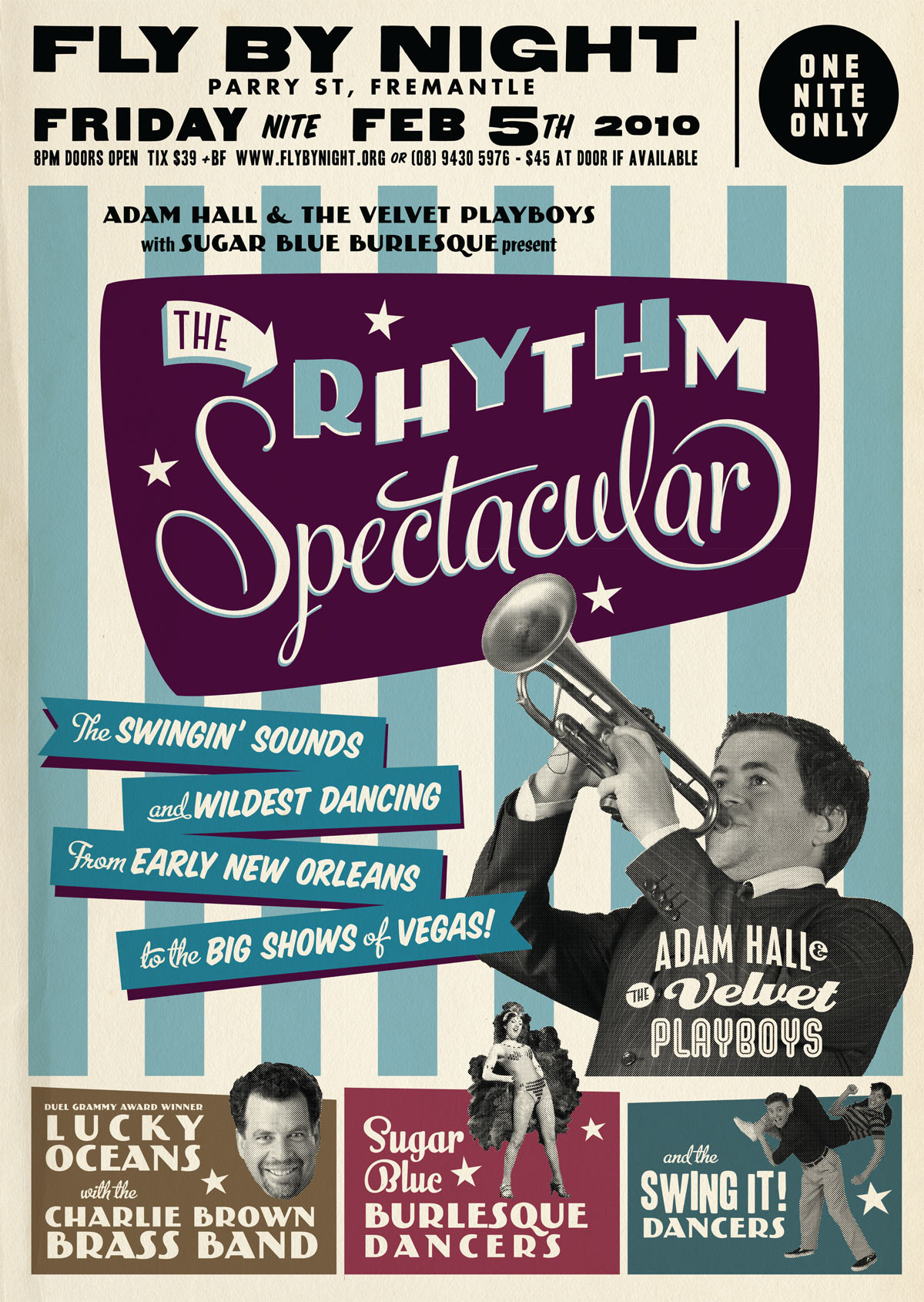
I’ve designed a few concert posters recently based on a vintage “tour blank” style of poster. But what is this style?

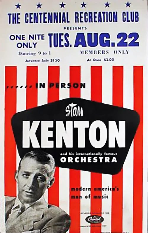
In the US from the 1920s to the 1960s, touring musicians commissioned eye-catching poster designs to promote their upcoming tours in a style shown in the examples below.

Determined to grab your attention, the designs were bold. Usually 2 or 3 bright colours were used along with arrows, circles, stars and stripes to direct the eye. As was the process of the day, the type was generally hand-lettered. Most of these designs used publicity photos of the artists, often using just their heads cut out from the background (alternatively, a caricature would be used).

It would have been expensive to produce a separate poster design for each of the destinations on their tour, so they would print a generic poster and leave a blank space (usually at the top) to add specific venue information at a later date. This venue information was printed (usually by letterpress) locally by the promoter. Sometimes the information was simply drawn on to each poster by hand. As a consequence the part with the venue information has a more amateurish appearance than the rest of the poster, which I tried to replicate with my modern interpretations.

I tried out some letterpress printing using wood type recently at the Melbourne Museum of Printing. I’ll go into more detail in a later post, but if you are a student of graphic design it is a visit I definitely recommend!

It’s worth noting that nowdays these “tour blank” concert posters are sometimes identified as “boxing style”.

Check out these posters advertising touring multi-act “revue” style shows! Now that’s a busy poster design! (but they sure look like fun concerts!)

Special thanks to Dr. Dennis Hickey for permission to use images from his fantastic poster collection. If you’d like to learn more check out his vintage concert poster collecting website. I also recommend Pete’s Poster Central site for more information on vintage tour blanks.

Shout and Feel It

Just a quick thank you to all of you who posted the kind comments on my welcoming post. I was hoping that I’d get maybe 10 people come and say hi, so it’s pleasing to see currently more than 70! I don’t have that many relatives so I guess there are people out there who are actually keen to win a signed Transformers cover art book!

artoftrevorhutchison

I’ll be randomly selecting 5 winners on March 12th, so if you haven’t said “Hi” yet there's still time! Tell your friends!

I’d also like to give a quick shout-out to design blog Australian Edge and Wordpress wizards Graph Paper Press for showcasing my work this week. Thanks guys!

The making of a comic book cover

To launch my new website and blog, I’ll be posting a few articles exploring my design process. Let me know if you’d like to see more of this kind of thing!

In the image above you can see the technique and creative process I used to construct one of my covers for IDW’s Transformers: All Hail Megatron.

I started with a basic sketch to put what was in my head on paper. [spoilers] This issue (AHM#9) featured the return of Autobot leader Optimus Prime, so I wanted something that would depict the return of the heroic leader. One of the overriding themes of All Hail Megatron was the concept of leadership; both different styles of leading and characters’ reactions to lack of, failure of, or objectionable leadership. To hint at this I used a propaganda style on many of the covers.

You can see this kind of defiant hero pose in these WWII propaganda posters:

propaganda.jpg

Once I had the concept down on paper I began constructing the basic shapes of Optimus Prime in Adobe Illustrator. You can see that his stance and details evolved from the sketch.

Once I had the basic shapes and silhouette I pasted it into Photoshop and added the basic lighting and more detail. I reworked some of the shapes to better suit the composition of the page. One of the ideas I was keen to use was to have Prime blocking part of the title of the comic “All Hail Megatron” - an act of defiance against Megatron. (A second title was ultimately added in editing to make sure the comic’s title was clearly legible.)

The final step was to apply shading and textures which were sourced from scans of spray paint textures. I wanted the rough texture because it was closer to the style of many of the mid-century posters which were often airbrushed. You can get a sense of the texture in the detail shown below:

I made a late decision to turn his head to face away from the viewer because I felt he appeared stronger this way. Each artist has a different approach to drawing the characters. To illustrate my version of Optimus Prime I referenced Primes drawn by regular Transformers artists E.J Su and Guido Guidi but stylized the features and proportions to suit the style of the cover.

This cover for All Hail Megatron #9 was included in Comic Book Resources (CBR’s) 50 best covers of 2009