Found these images from Motorsports Images and was curious how their embedding feature worked.
Embed Block
Add an embed URL or code.
Found these images from Motorsports Images and was curious how their embedding feature worked.
I recently updated the tour poster for Japanese Funk Bank Osaka Monaurail. I combined elements of vintage tour blank posters, live and studio photography and Japanese Manga art. The purple was chosen to echo the band’s distinctive purple suits.

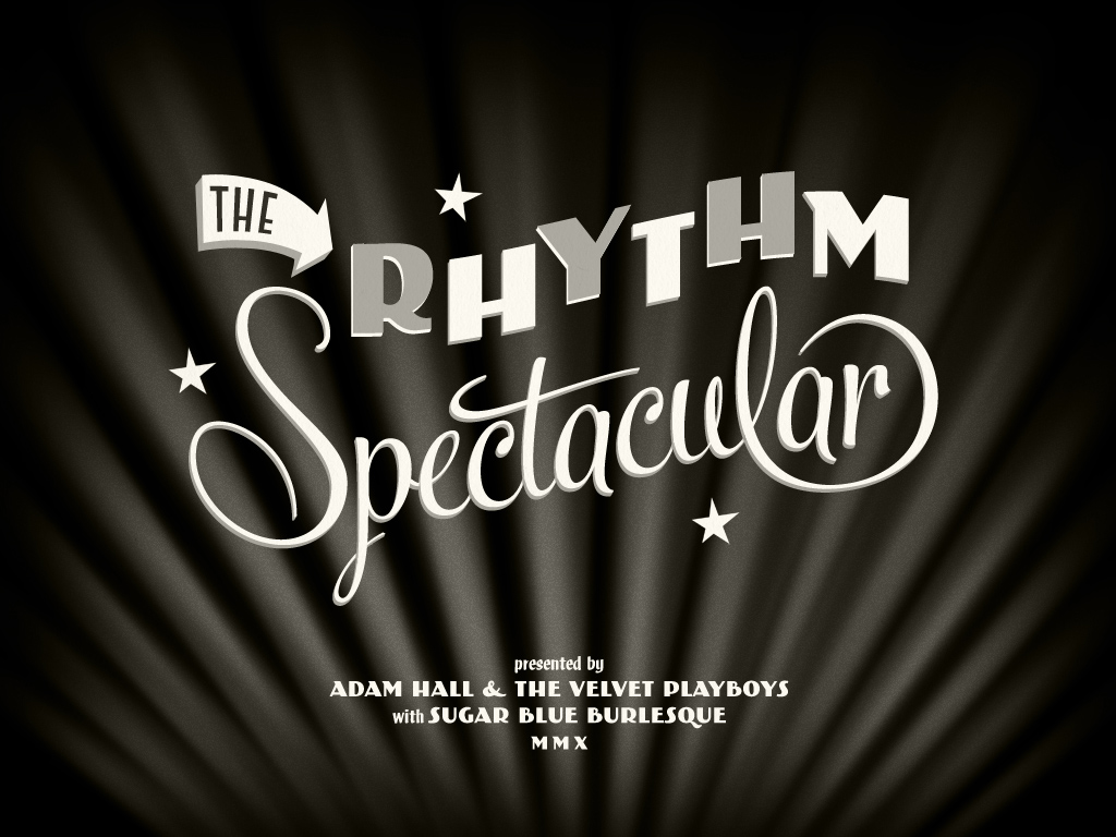
Over the past few years I have specialised in designing posters with a vintage or retro feel for musicians, artists, events and entertainers. It’s about this time of year that things get busy for Fringe World in Perth, so please contact me if you’re after something special for your show.
More details here.


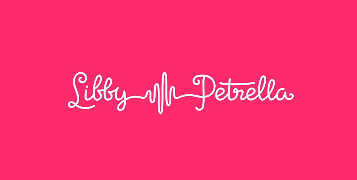
This was a logo concept for a Melbourne radio host that was ultimately not used, but I had fun with the custom lettering. The nice thing about having a blog is I can put up design work like this that wouldn’t be seen otherwise.
I recently discovered the illustration work of Danish artist Mads Berg. He has a beautiful authentic vintage style that somehow doesn’t look out of place in a modern context. Inspiring stuff.

Like many, I’ve been enamoured by Netflix’s Stranger Things TV series. Whilst I’ve never really been into horror as a genre, there’s something about the combination of good suspenseful writing, science fiction and on-point 80s nostalgia.
Part of that was the title sequence featuring the internet’s most talked-about title font; ITC Benguiat. This article takes a fascinating look into the history and inspiration for the choice of typeface.
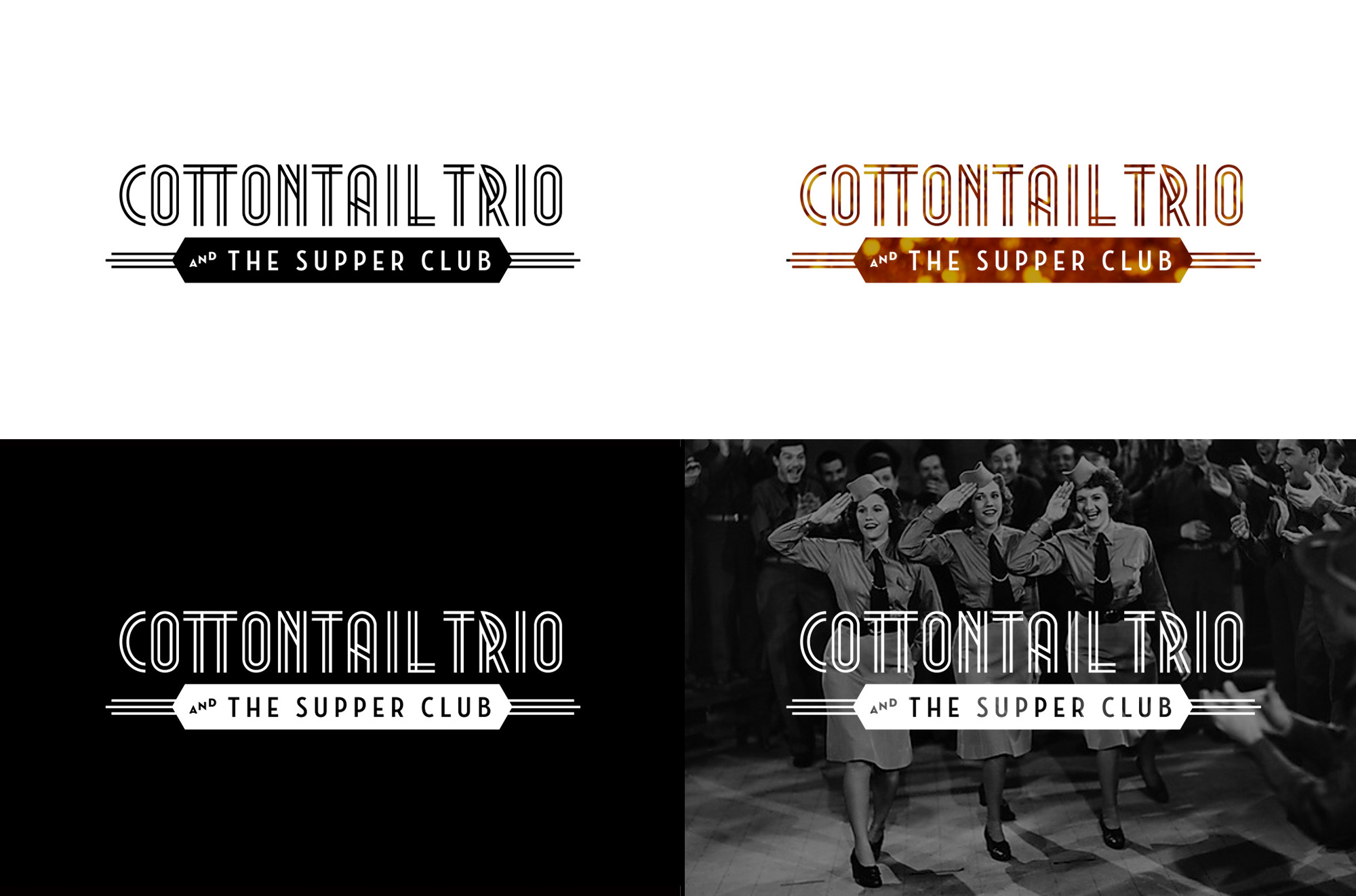
Although not my primary focus, over the years I have developed the corporate and brand identities for a wide variety of businesses, events and groups. It’s always an enjoyable challenge to attempt to encapsulate the character of a company within a succinct, attractive and memorable design.
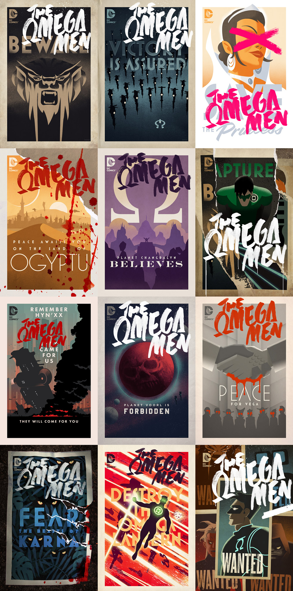
I recently had a chat with Comics Alliance about the process of creating the covers for DC Comics’ Omega Men Series
Introducing Fletcher William Hutchison, arrived safely into the world on 12th September 2015.


The cake was good. So was the weather.

I love this. To mark the 70th anniversary of its “Flying Kangaroo”, Qantas has painted their final Boeing 737-800 in a retro 1970s-era livery...
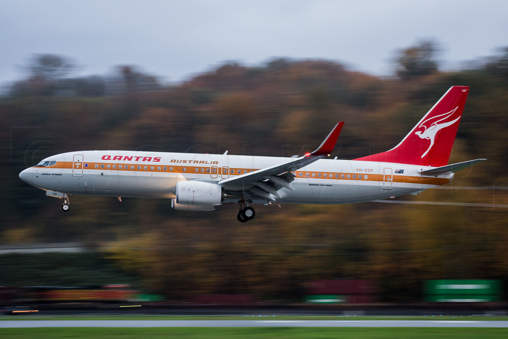
When I was a kid I used to make model aeroplanes, and I went through a phase of putting together kits of various airliners. This meant I played close attention to the colour schemes of the different airlines (in retrospect this probably contributed to my early graphic design education!).
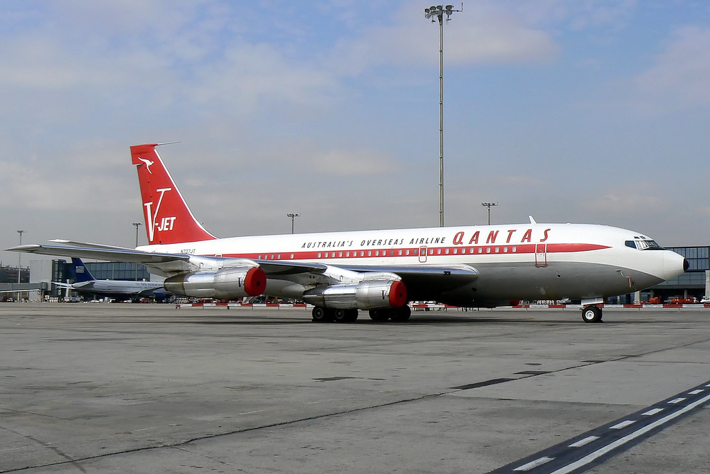
This is perhaps my favourite Qantas livery, seen here on John Travolta’s Boeing 707:
I recently watched this fascinating documentary about the art of Sign Painting. I recommend checking it out – It delves into the history, the artistry, the personalities and sadly, the changes in the sign making industry that has seen a rapid transformation of the aesthetics of our built environment.
It’s a time for new beginnings. I’ve recently started working with the fantastically talented bunch of guys and gals at Clever Starfish. I’m going be concentrating more on website design specifically, which (weirdly) is a return to my design roots.
The first of my designs to go live is for Tutti Frutti Frozen Yogurt. Check em out next time you are in Leederville (or any of their 580 locations worldwide!).

Really enjoying the vintage design work found in Paul Malon’s Flickr photostream
Brea Grant just let me know that my cover design for her We Will Bury You comic book made IGN’s Top 100 Comic Book Covers for 2010. It’s at #81, but I’ll take it. Maybe next year I’ll make the 70s.

After 6 months travelling around South America (with a brief visit to Canada and the US) I’m back in Perth and ready to get back to it. Keep an eye out for more regular updates! If you're curious to what we got up to (ice trekking, being robbed, piranha fishing, speaking bad spanish...) check out our travel blog at southamerica2010.com

This website has been a little quiet for a while as I’ve been travelling in South America. I’ll be in North America in December and back in Australia (and looking for graphic design work) in early January 2011. In the meantime things will be a little quiet around here. I have some cover design work coming out for IDW in the months I’m away and if you’re super keen you can follow our travels at southamerica2010.com
Adios!
One of my big design inspirations is the poster work of the Works Progress Administration (WPA); a "New Deal" agency formed by the US government in the 1930s to help end depression era unemployment.

The Library of Congress has a great searchable archive of close to 1000 WPA posters (500 of them are about not getting syphilis: good to know!).
Most of the posters feature bold abstracted designs and type typical of the modernisim that is associated with the Art Deco era. Despite the often semi-professional status of the artists who made them, they have come to have their own identifiable style. The posters are a lesson in simplicity, whilst maintaining personality.
You can see their direct influence in my own posters and cover artwork for Transformers: All Hail Megatron.
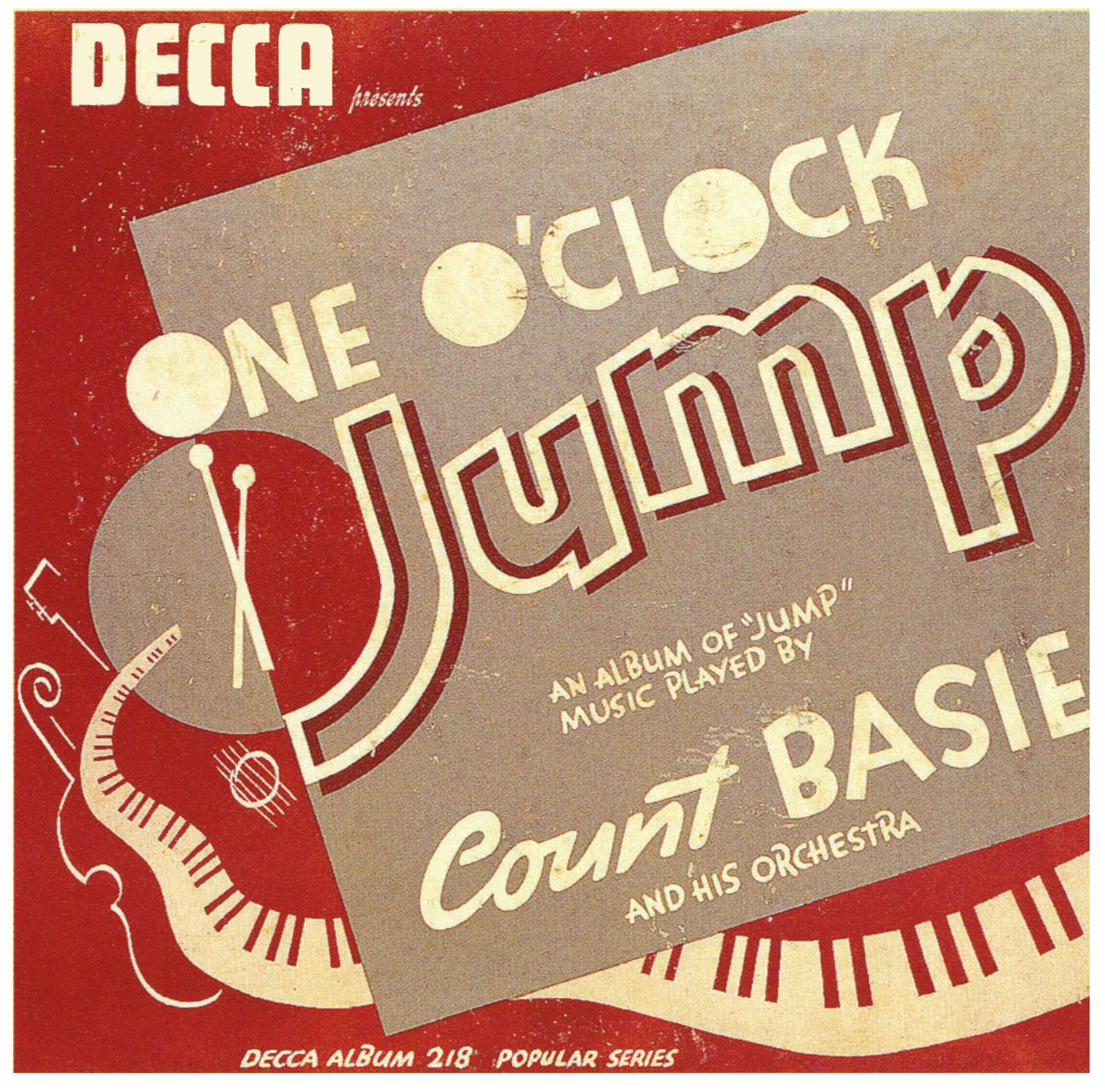
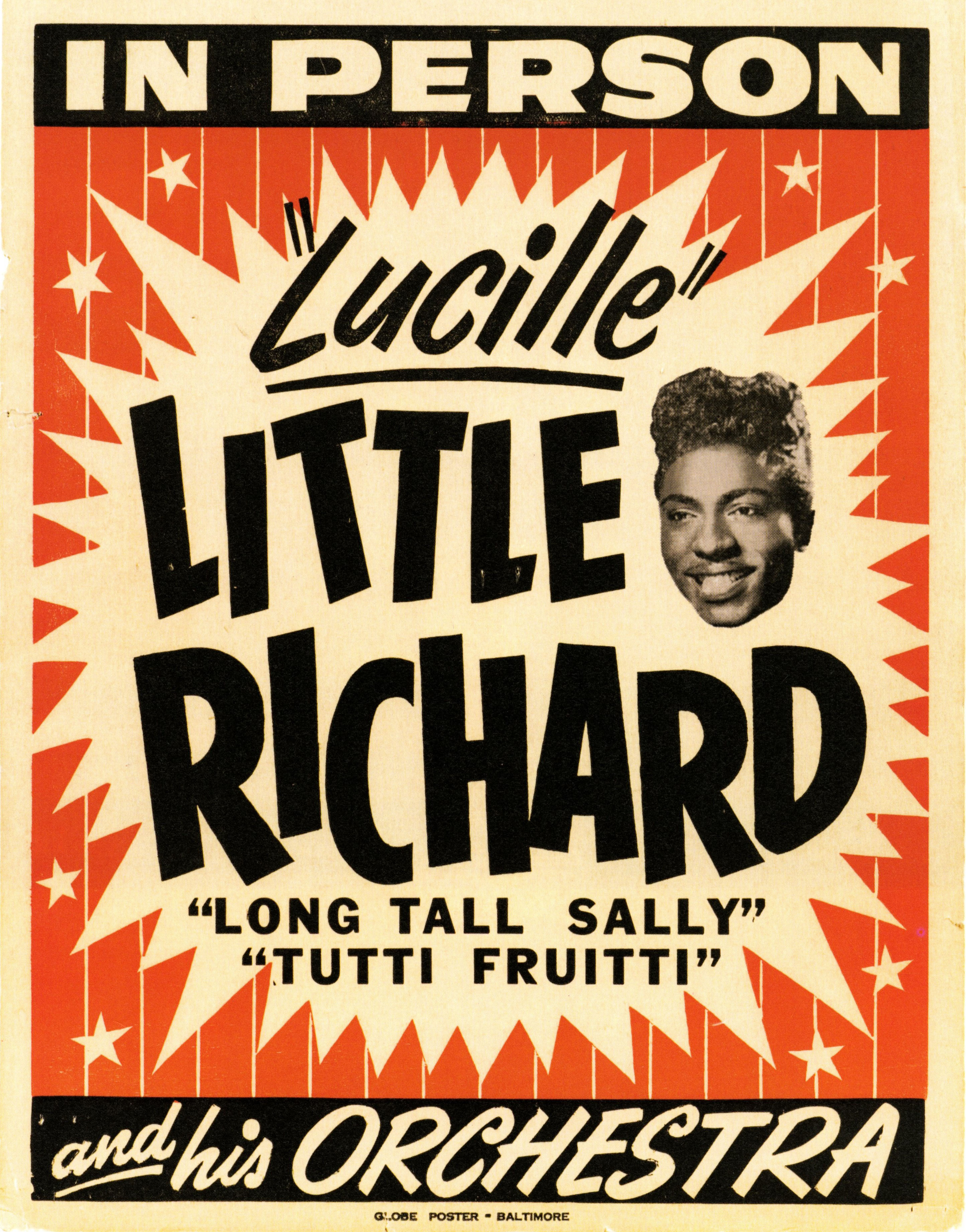
You may also be interested in my article on vintage concert poster design.