Retro Qantas Livery

I love this. To mark the 70th anniversary of its “Flying Kangaroo”, Qantas has painted their final Boeing 737-800 in a retro 1970s-era livery...

Qantas 737 Retrojet VH-XZP

When I was a kid I used to make model aeroplanes, and I went through a phase of putting together kits of various airliners. This meant I played close attention to the colour schemes of the different airlines (in retrospect this probably contributed to my early graphic design education!).

This is perhaps my favourite Qantas livery, seen here on John Travolta’s Boeing 707: 

N707JT

WPA Poster Archive

One of my big design inspirations is the poster work of the Works Progress Administration (WPA); a "New Deal" agency formed by the US government in the 1930s to help end depression era unemployment.

The Library of Congress has a great searchable archive of close to 1000 WPA posters (500 of them are about not getting syphilis: good to know!).

Most of the posters feature bold abstracted designs and type typical of the modernisim that is associated with the Art Deco era. Despite the often semi-professional status of the artists who made them, they have come to have their own identifiable style. The posters are a lesson in simplicity, whilst maintaining personality.

You can see their direct influence in my own posters and cover artwork for Transformers: All Hail Megatron.

You may also be interested in my article on vintage concert poster design.

We Will Bury You #3 out now!

“We Will Bury You” issue 3 from IDW Publishing is in comic stores today! It’s got zombies, is set in 1920s New York, and features my cover design – Awesomeness! The series is written by Heroes actress Brea Grant and her brother Zane and drawn by Kyle Strahm. So far the reviews have been pretty positive.

This was my first non-Transformers cover for IDW, and it was slightly daunting to be following Ben Templesmith and Eisner winner Nate Powell on cover duties. The brief was to to do it as a mock 1920s movie poster and I had a lot of fun researching styles, layouts and techniques of the era.

Look for it in your local comic book store!

Happy Birthday Duke

Duke Ellington and I share a birthday today, so to celebrate, here's a look at how records (remember them?) were made in the 1930s with Duke Ellington's Orchestra performing Oh Babe, Maybe Someday with Ivie Anderson. "Electrically engraved with the world's finest entertainment!".

Happy Birthday Duke!

Home of Tomorrow!

This was the home of the future, according to a 1956 newspaper illustration.

Okay, so maybe we don't all land a helicopter on the roof, and you probably shouldn't be smoking that pipe indoors, but much of this is spot on. Big flat-screen wall-mounted TV, dishwasher, microwave, modernist architecture... and I'm pretty sure that's an iMac on the right!

Via Googie Architecture Online

Hutchison-McCarthy Animation Studios

Here’s a rare look behind the the scenes at Hutchison-McCarthy Animation Studios. Those hilarious characters you know and love are all products of the imagination of these hard-working fellows. Wacky!

Okay, so we’re not opening an animation studio. Last weekend my buddy and fellow Transformers colleague Shane McCarthy and I attended a Disney themed party. So instead of going as the usual Mickey, Prince Charming, Tigger or Mad Hatter we went as... wait for it... “Disney Animators from the Golden Era of Animation”.

Now to effectively pull off our “Golden Era Animator” costumes we needed props. We had the sweater vests, the rolled sleeves, slicked hair and spectacles taken care of, but to really sell it we needed more. We found some clipboards and a few sheets of animation tracing paper. I then redrew (okay, there might have been some tracing involved) a Fred Moore sketch from All The Cats Join In and a fake character reference sheet for Walt Disney’s early Oswald the Lucky Rabbit character (obscure enough?).

I also was able to track down (through the joys of Google) a 1930s Walt Disney Productions identification card. I enlarged and cleaned it up in Photoshop and then added in our own names in an old typewriter font to make our very own Disney ID cards which we attached to lanyards.

I think it made a nice change from all the Alice in Wonderland costumes. That, and nobody needs to see me in a blue dress.

A walk down Cloudstreet

Yesterday I had a bit of fun as an extra in a television miniseries. An adaption of Tim Winton’s novel Cloudstreet, set in 1940s Perth, is currently being filmed and I answered the call for retro looking dudes who could bust a few dance moves.

Dapper gents?

Dapper gents?

It was a long day which started with hair, makeup and costuming. To make things easier I brought my own 1949 vintage suit, which I was fortunate to find in mint condition in a vintage clothing store in Sydney last year. It was perfect for the period and amazingly fits like a glove! There were about 20 extras in the scenes we were shooting and some serious transformations took place. The gents all looked quite dapper and the ladies were all stunning. If only people made the same effort these days!

Preparing the extras

Preparing the extras

We had two scenes. The first was set in a crowded restaurant, where were had fun miming fake conversations in the background and walking through the scene. Sounds pretty easy, hey? But when the scene lasts several minutes and there are multiple takes and multiple cameras, it becomes quite a challenge to repeat your movements exactly each take and time them with the actors’ dialogue. We had an assistant director that was very helpful cuing us and hair and makeup people fussing over us throughout.

The second scene was a dance scene set in the “Embassy Ballroom” We partnered up and pulled out our best moves, all the time being careful not to hip-and-shoulder the lead actors; Emma Booth and Oliver Ackland . There was a mix of experienced dancers and non-dancers which I think will add some nice authenticity. We were asked to dance as quietly as possible (the music was turned right down to allow the recording of the actors lines) so no big stomps!

Cloudstreet dance scene filming

We finished off the night by recording the background noise for the previous restaurant scene. We basically talked nonsense for 4 minutes while they recorded us! I think I said something about feeding the dog lobster, so listen out for that! (might wanna turn the volume up, like WAAAY up!)

All in all, a fun day and it’s nice to get way from the computer screen. If all goes well, my elbow might make the final cut.

House Party

Aside from producing fabulous fonts, like those found in their latest Eames collection, House Industries make the most over-produced, over-the-top, yet beautiful print catalogs. They are one of my favourite design studios and I always look forward to seeing what they do next.

Galerie Montmartre

One day, when I find myself with a bunch of spare cash lying around, I'm going to pop over to Galerie Montmartre and pick up an authentic vintage poster such as this. In the meantime I'll just have to be satisfied geeking out at their online collection.

Get Shorpy

I could spend all day looking at the marvellous vintage photograph collection on Shorpy. Make sure you check out the eye-popping colour Kodachromes. They look like they were taken yesterday!

Jessica Hische exhibition in Melbourne

I’ve been admiring the work of NY based typographer, designer and illustrator Jessica Hische from afar for a while now, but last weekend whilst on a short visit to Melbourne I was excited to able to catch an exhibition of her excellent typography work in person. The exhibition was pretty small (let’s say bedroom–sized). But I really enjoyed geeking-out at her detailed lettering up close. There’s a definite retro-ness to her work (perhaps that should be “respect for typographic history”?) and it's super-playful.

I picked up a limited edition print which will be sure to get the framing treatment and go straight to the pool room.

More internettings of Jessica here.

Casarramona

One of my favourite contemporary illustrators is Zürich-based designer Michel Casarramona. He makes fantastic use of caricature, custom typography and colour, and wraps it in retro-inspired goodness. Like.

Vintage concert poster design

I’ve designed a few concert posters recently based on a vintage “tour blank” style of poster. But what is this style?

In the US from the 1920s to the 1960s, touring musicians commissioned eye-catching poster designs to promote their upcoming tours in a style shown in the examples below.

Determined to grab your attention, the designs were bold. Usually 2 or 3 bright colours were used along with arrows, circles, stars and stripes to direct the eye. As was the process of the day, the type was generally hand-lettered. Most of these designs used publicity photos of the artists, often using just their heads cut out from the background (alternatively, a caricature would be used).

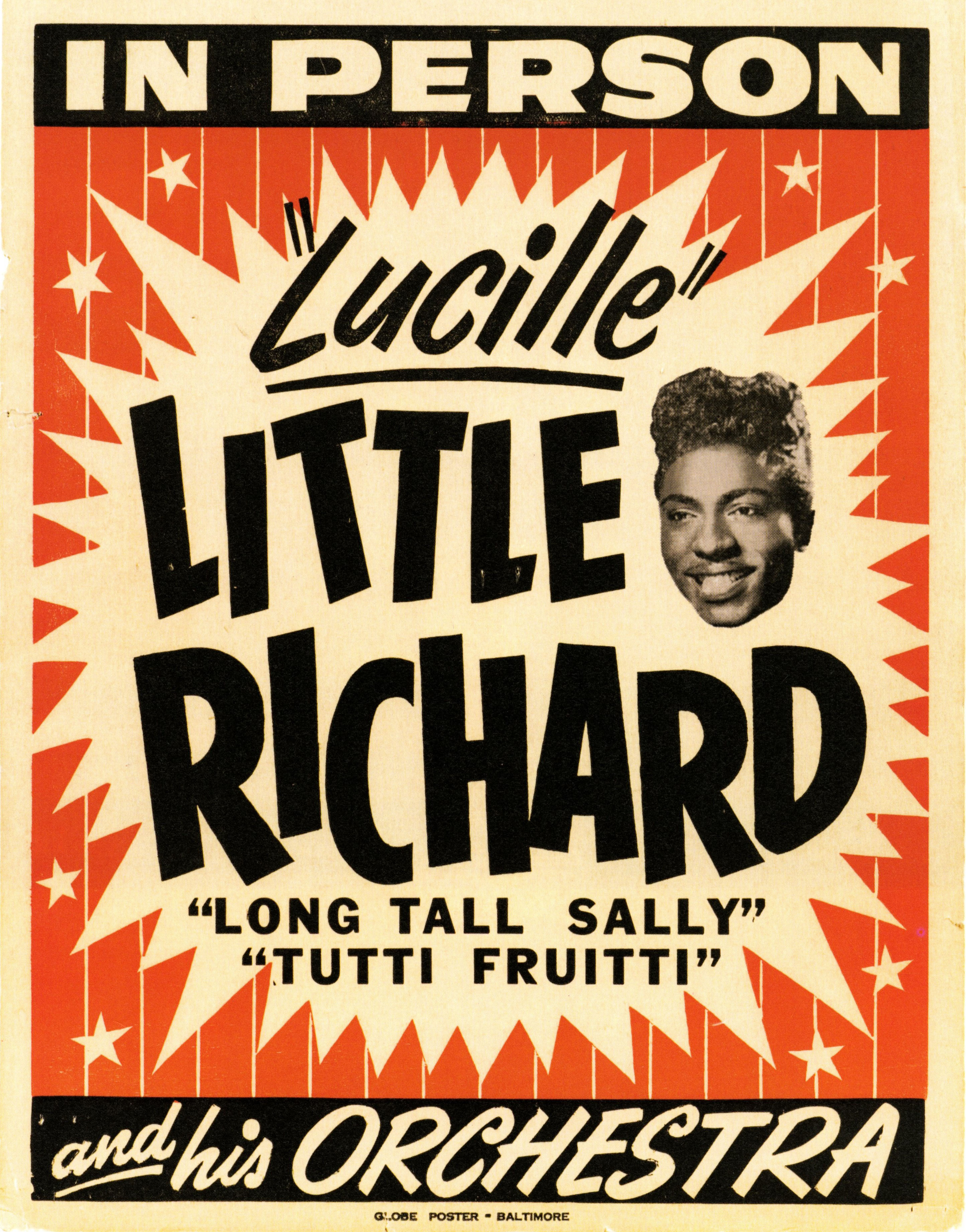
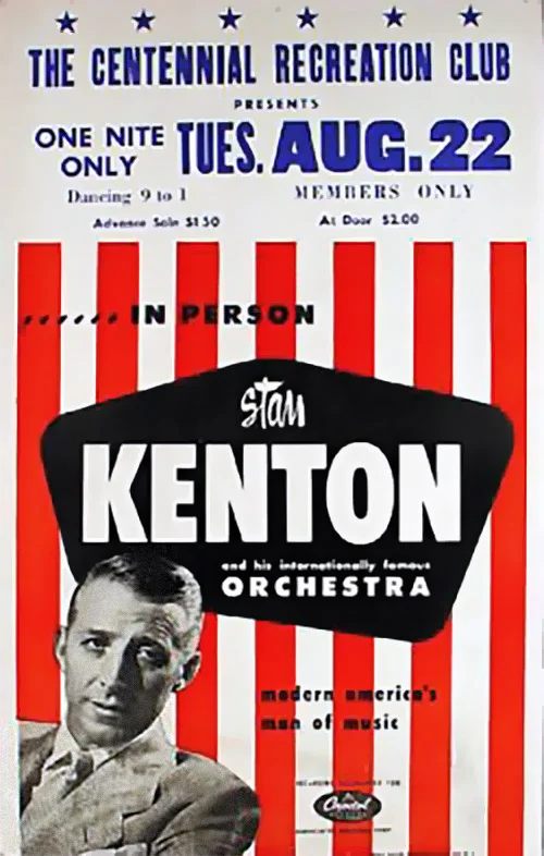
It would have been expensive to produce a separate poster design for each of the destinations on their tour, so they would print a generic poster and leave a blank space (usually at the top) to add specific venue information at a later date. This venue information was printed (usually by letterpress) locally by the promoter. Sometimes the information was simply drawn on to each poster by hand. As a consequence the part with the venue information has a more amateurish appearance than the rest of the poster, which I tried to replicate with my modern interpretations.

I tried out some letterpress printing using wood type recently at the Melbourne Museum of Printing. I’ll go into more detail in a later post, but if you are a student of graphic design it is a visit I definitely recommend!

It’s worth noting that nowdays these “tour blank” concert posters are sometimes identified as “boxing style”.

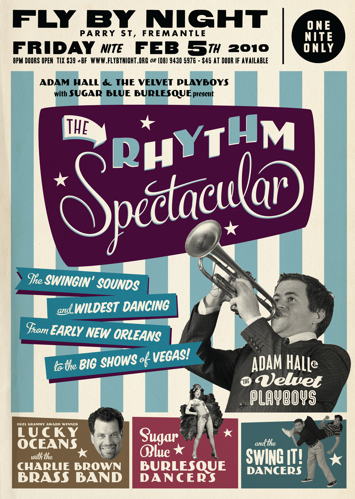
Check out these posters advertising touring multi-act “revue” style shows! Now that’s a busy poster design! (but they sure look like fun concerts!)

Special thanks to Dr. Dennis Hickey for permission to use images from his fantastic poster collection. If you’d like to learn more check out his vintage concert poster collecting website. I also recommend Pete’s Poster Central site for more information on vintage tour blanks.